Steady
Concept Project
An app for the long stretches between biologic doses.


WHY THIS EXISTS
Most chronic-illness apps are dose-trackers built like spreadsheets, cold, data-first, only relevant on dose days. But people on biologics spend most of their time between doses, in the long quiet stretches where life actually happens. Steady is the app for those days.
VOICE
How Steady speaks.
Example lines from the product. The voice is the design.
No exclamation points. No emoji. No we. The voice observes, then offers context and knows when to step back.
THE PRODUCT
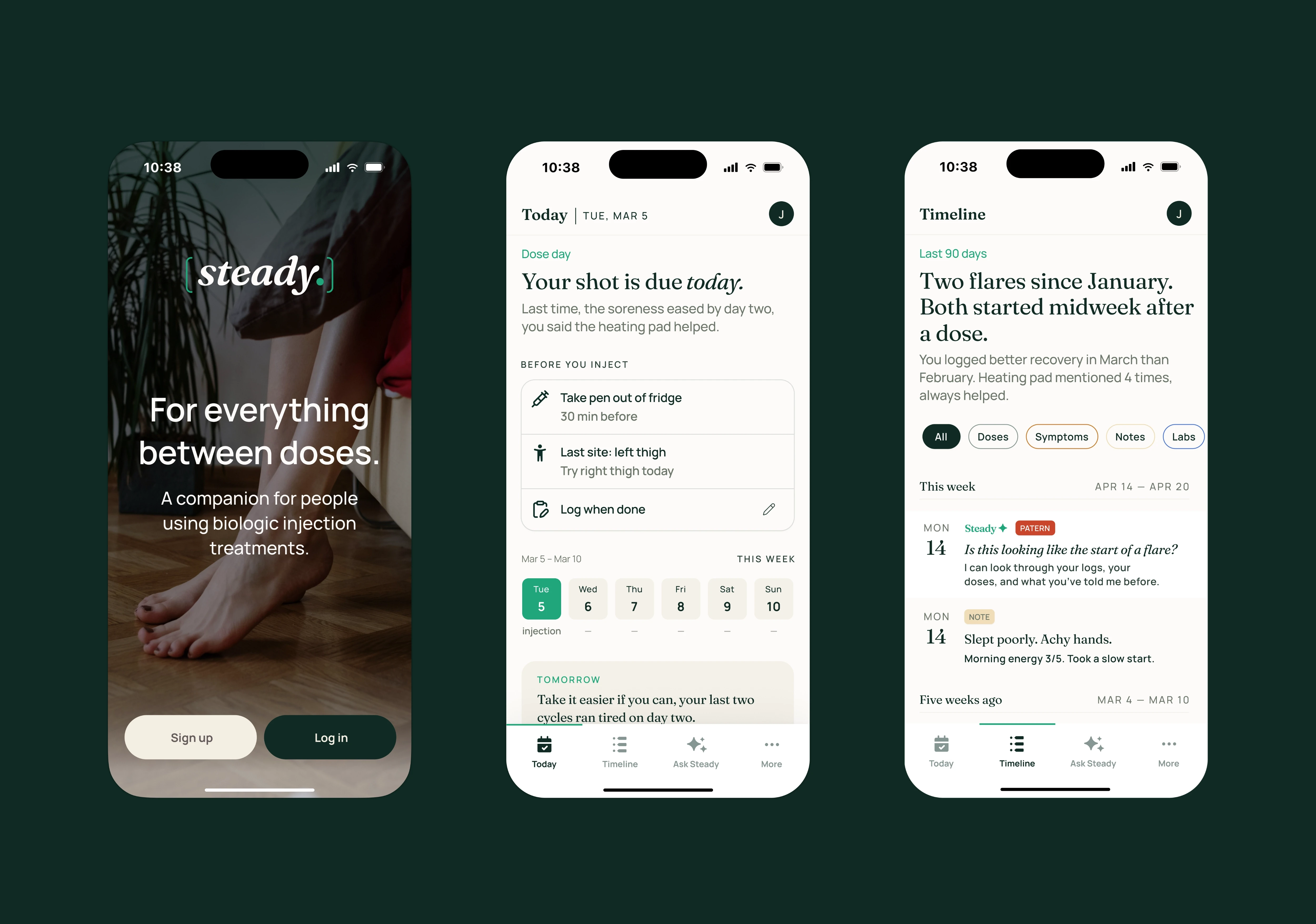
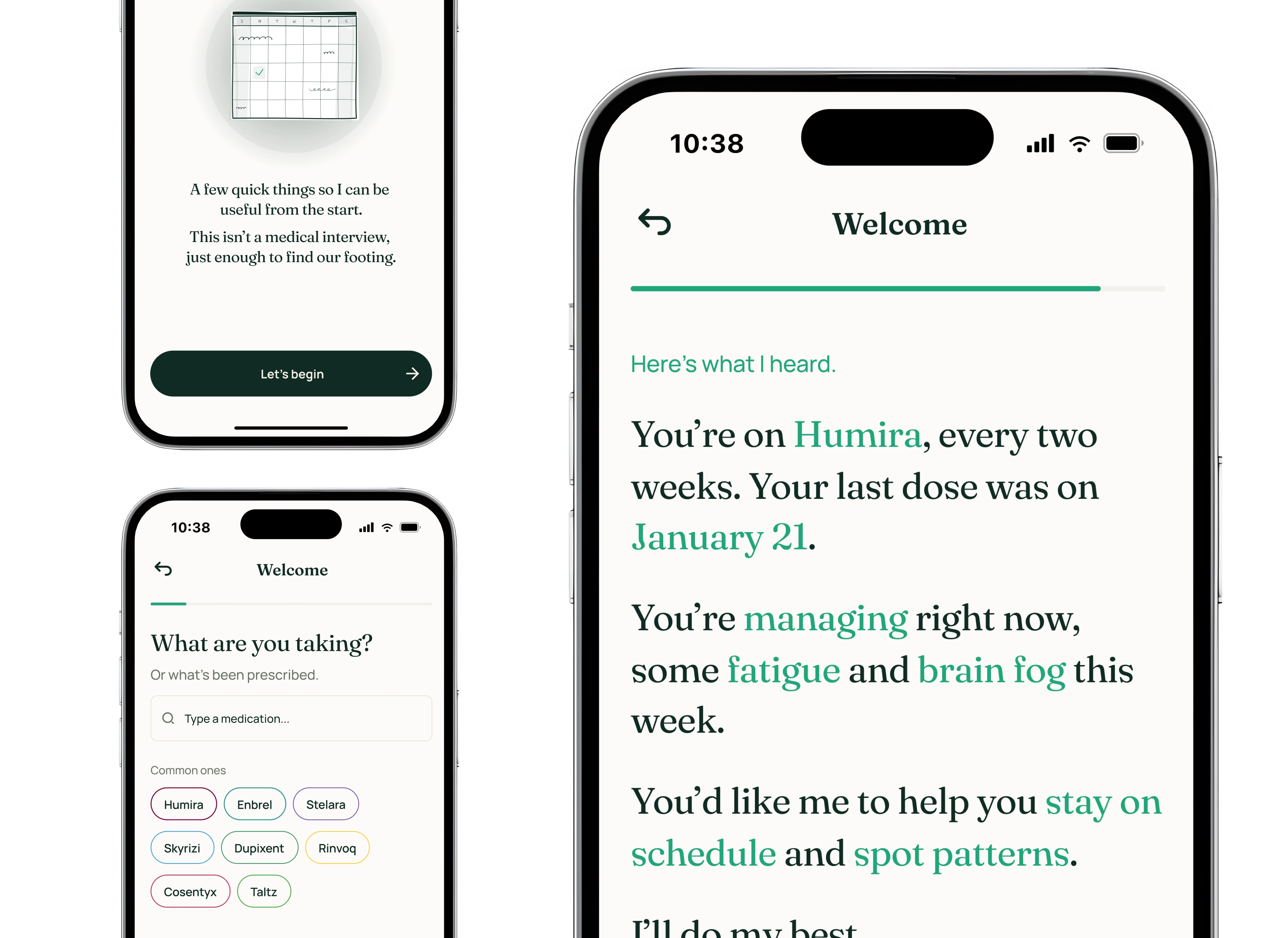
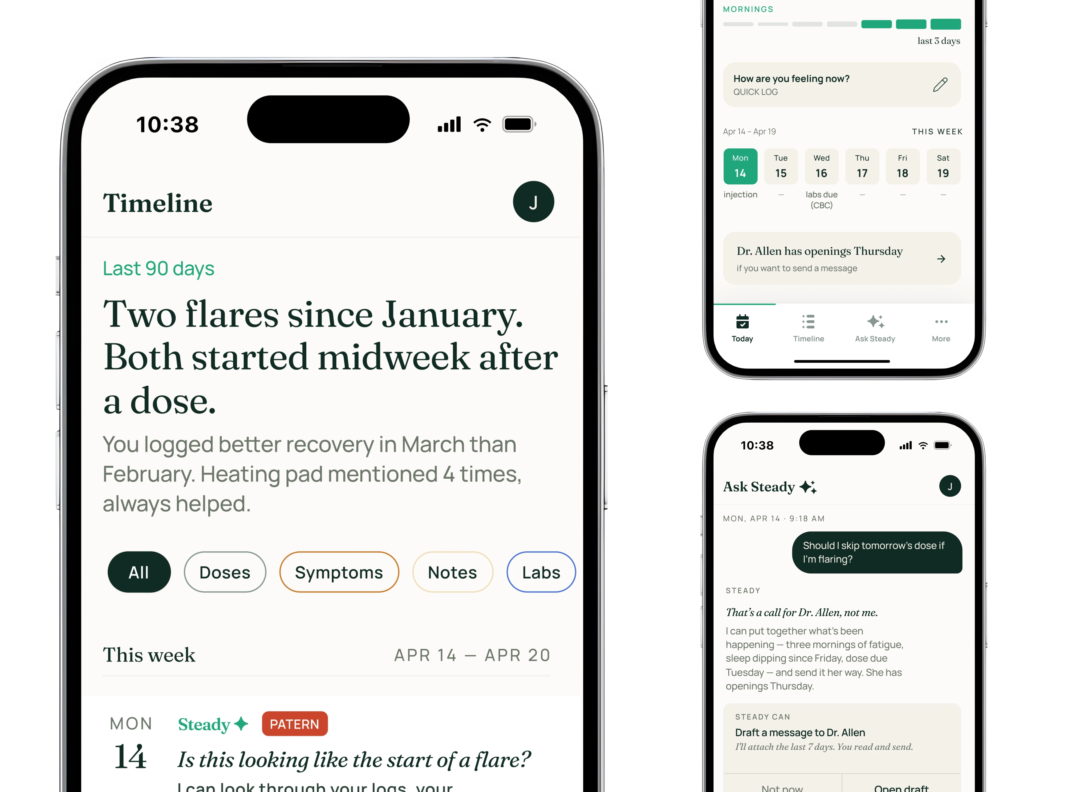
The same voice, across every screen.
Each screen names what’s true today and gets out of the way.
BRANDING
An identity built on restraint.
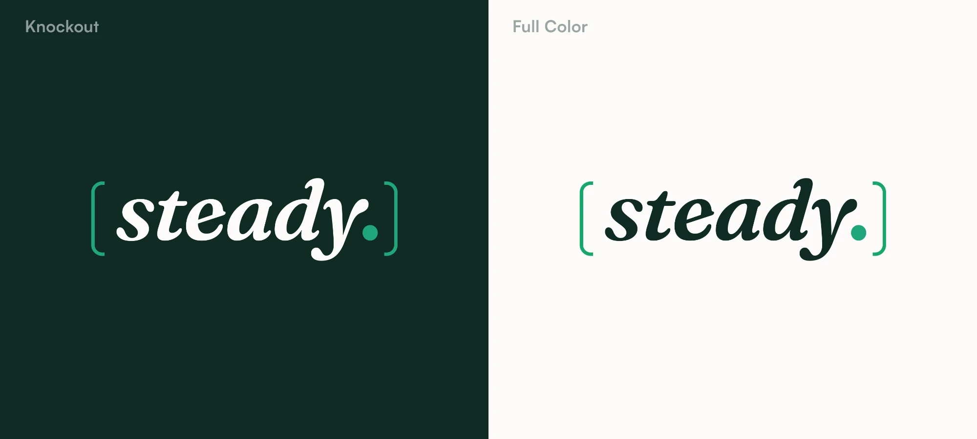
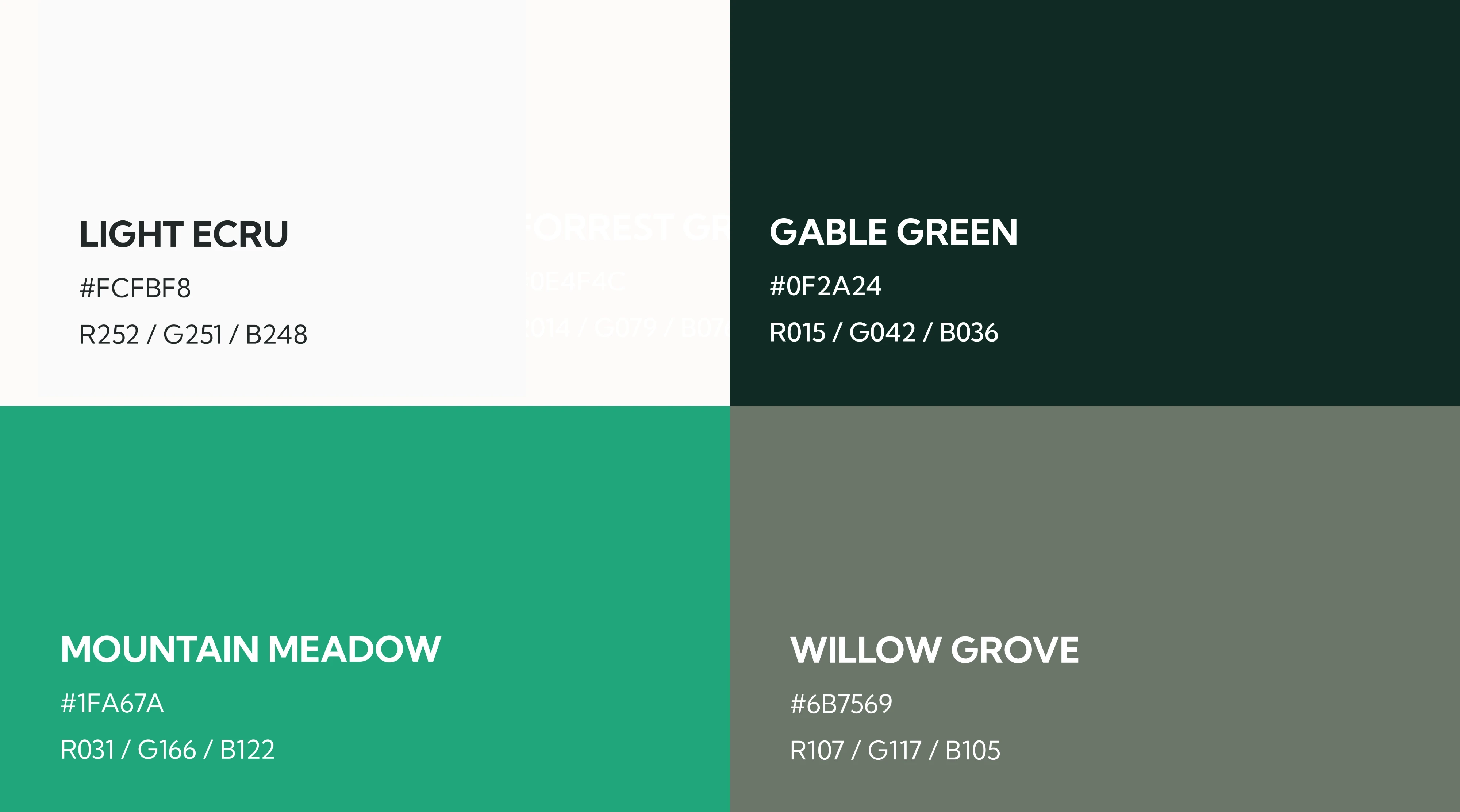
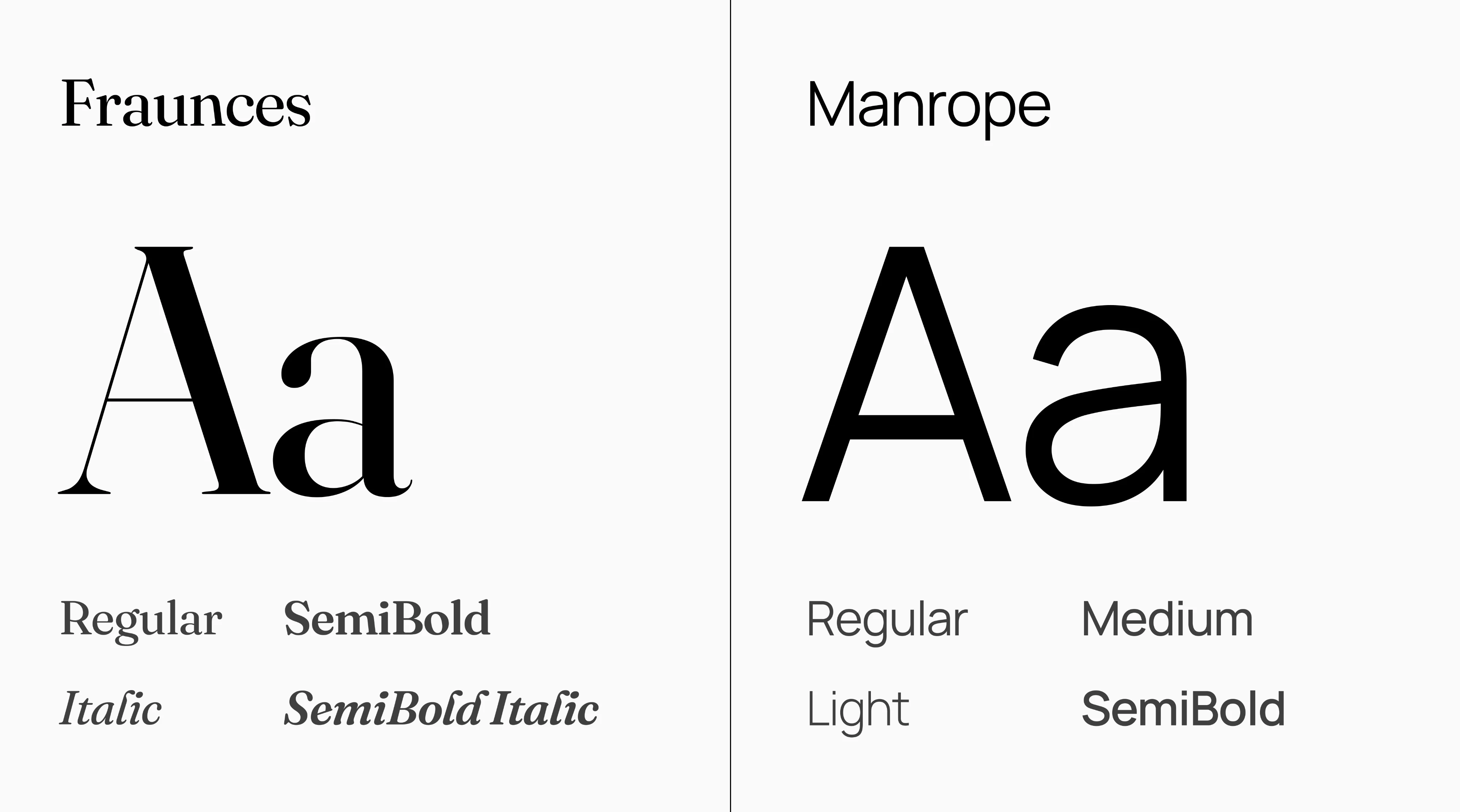
The wordmark holds the italic serif inside upright brackets, the patient in motion, the app providing structure. Bone, deep forest, mint. Fraunces mainly for voice, Manrope for interface.